

Background
Landchecker needed a new brand to reflect the new direction the business was embarking on. A clean modern design was needed to replace the outdated original logo and branding. The new visual identity had to be optimised to reflect all our different persons types as how each group uses the platform differs vastly. This then needed to be translated into a pattern library that was consistent across the design and development team in order to reduce design and development time and friction in the handover process.

Team
Contractors
Developers (frontend, backend developers)
UX Designer
Archetype Copywriters
AFoM Branding Agency
UX Methodologies
Stakeholder engagement
Design Leadership
Pattern Library
Design Ops
UI Design
Heat Mapping
Competitive/Comparative Analysis
Affinity mapping
Discover
We began this project by gathering our previous research, assessing any gaps and writing a plan to uncover any other insights we thought we might need. This included an update to the competitor analysis with particular attention to brand positioning, revisiting the persona’s created for previous projects and a few customer interviews uncovering what brands resonate with them and why.
Our product development framework is a process of discovering insights and/or problems to solve, designing and testing possible solutions before we begin developing a fully considered solution. Design
The next step was to engage with a contractor Achetype to produce a brand expression guideline. This was instrumental in defining how we presented ourselves in written form and verbally so as to have cohesive expression across the team. For example, using consistent language such as platform instead of app and plan instead of subscription.
Archetype delivered a 20 page brand expression guideline document and this was used to kick off a major customer journey mapping project which involved myself working together with the team at Archetype to document every point of interaction with the customer. Once this was documented we categorised each interaction into one of 5 sections to understand the customer's frame of mind at that point in their journey, understood their goals and completed a gap analysis of what we had published on the site and what content we needed to create to create a seamless and enjoyable user experience.

Journey mapNow that our tone of voice was on point we needed to make sure our visuals were inline. We engaged an award winning Graphic Design Agency A Friend Of Mine to come on the journey with us. We provided them with the customer research they needed for the job including competitor analysis, personas and a moodboard of other businesses in the industry that are winning at the brand game. They completed a brand refresh which included revamp of the colours, a new logo, fonts, graphic devices and image treatment all outlined in a well presented document as an exprended brand expression guideline.

Pages from the extended brand guide - Brand position by Archetype

Pages from the extended brand guide -values by Archetype

Pages from the extended brand guide - audience by Archetype

Pages from the extended brand guide - audience by Archetype

Pages from the extended brand guide - visual brand by AFoM
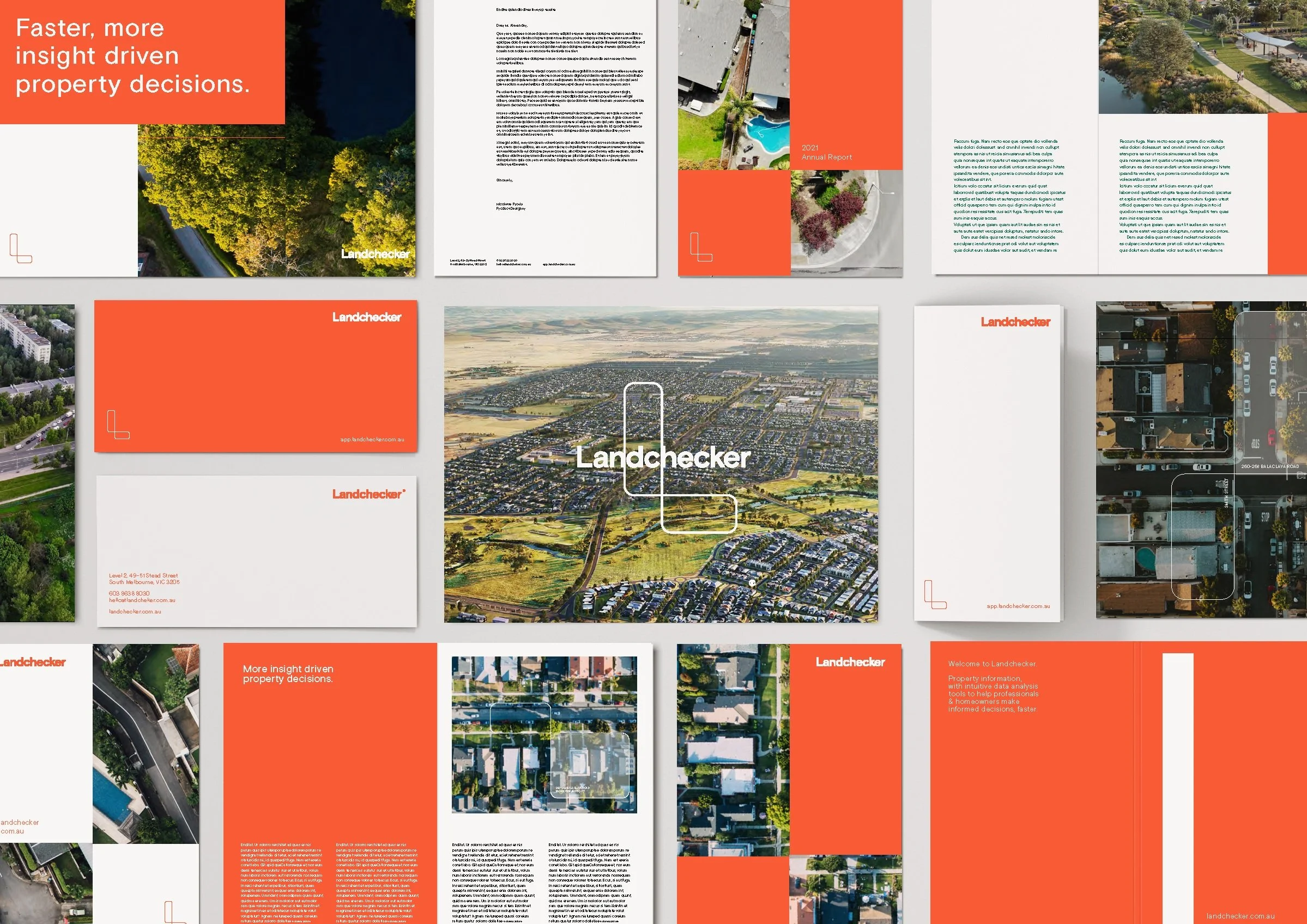
Pages from the extended brand guide - visual brand by AFoM
Develop
Once we had our direction finalised we set to work out how we might implement the new brand. Applying the new fonts, colours and logos to the platform was relatively straightforward with about 90% of the work being a straight swap and about 10% needing some design input on how it should look. The content pages on the other hand needed a full redesign. I mentored a new junior UX Designer through the process of redesigning the new pages from sitemap to high fidelity designs.
This process involved revisiting the customer feedback affinity map, which we developed as a separate project to help inform various decision making processes, to understand customers inquiries to see if there were any opportunities to create and edit content to help reduce customer support inquiries.

Affinity map of all the customer inquiries relating to High Resolution Aerial Imagery and possible solutions to reduce inquiries and improve user experience. As this was the first major design project our Junior UX Designer embarked on, my role was to work closely completing design reviews and assisting with developer handovers to make sure the designs were translated into pixel perfect releases.
Deliver
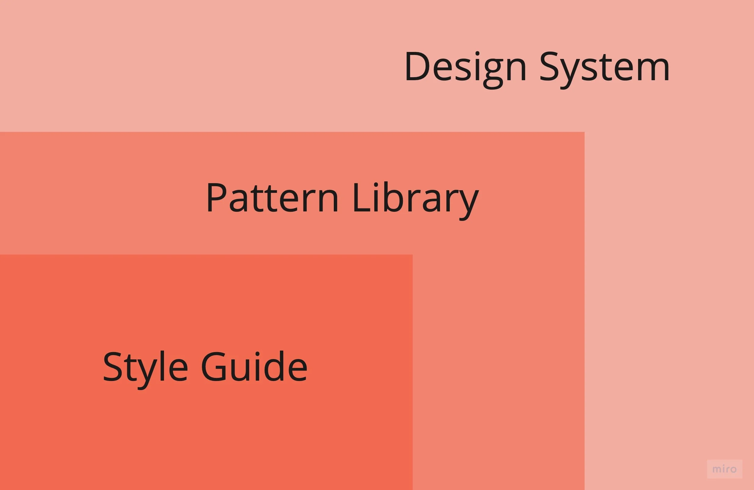
After all the work was completed I took it upon myself to develop a process around building out the pattern library with our bespoke components and refining the process for updating the pattern library. This was important so that when the team scales the foundations are in place for designers and developers to collaborate and efficiently and design teams can design and iterate high fidelity prototypes fast.
The pattern library needed to reflect updated brand expression guidelines as well as the MUI react framework that the developers were using so that we could create a design system that was cross-disciplinary, co-owned by design and tech and a single source of truth.
(Left) Landchecker Design System
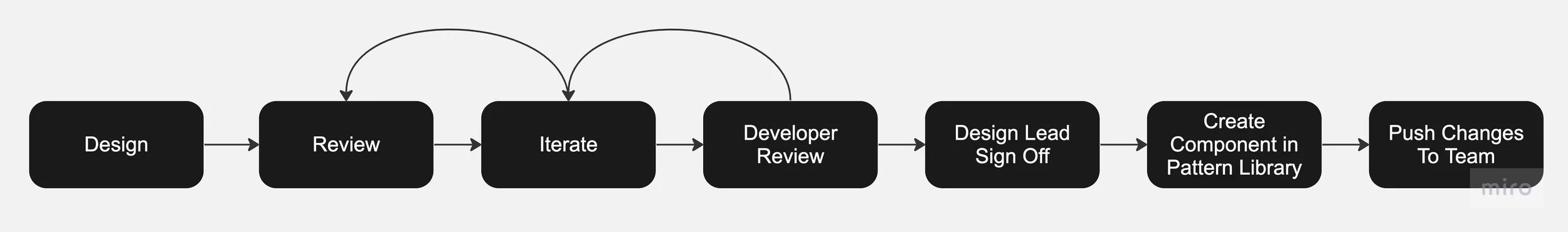
Process for updating the pattern library
The outcome of continually iterating and improving our pattern library is a reduction in the time it takes to design a prototype by 20% and improves collaboration between design and development teams in turn reducing the development time and tech debit.
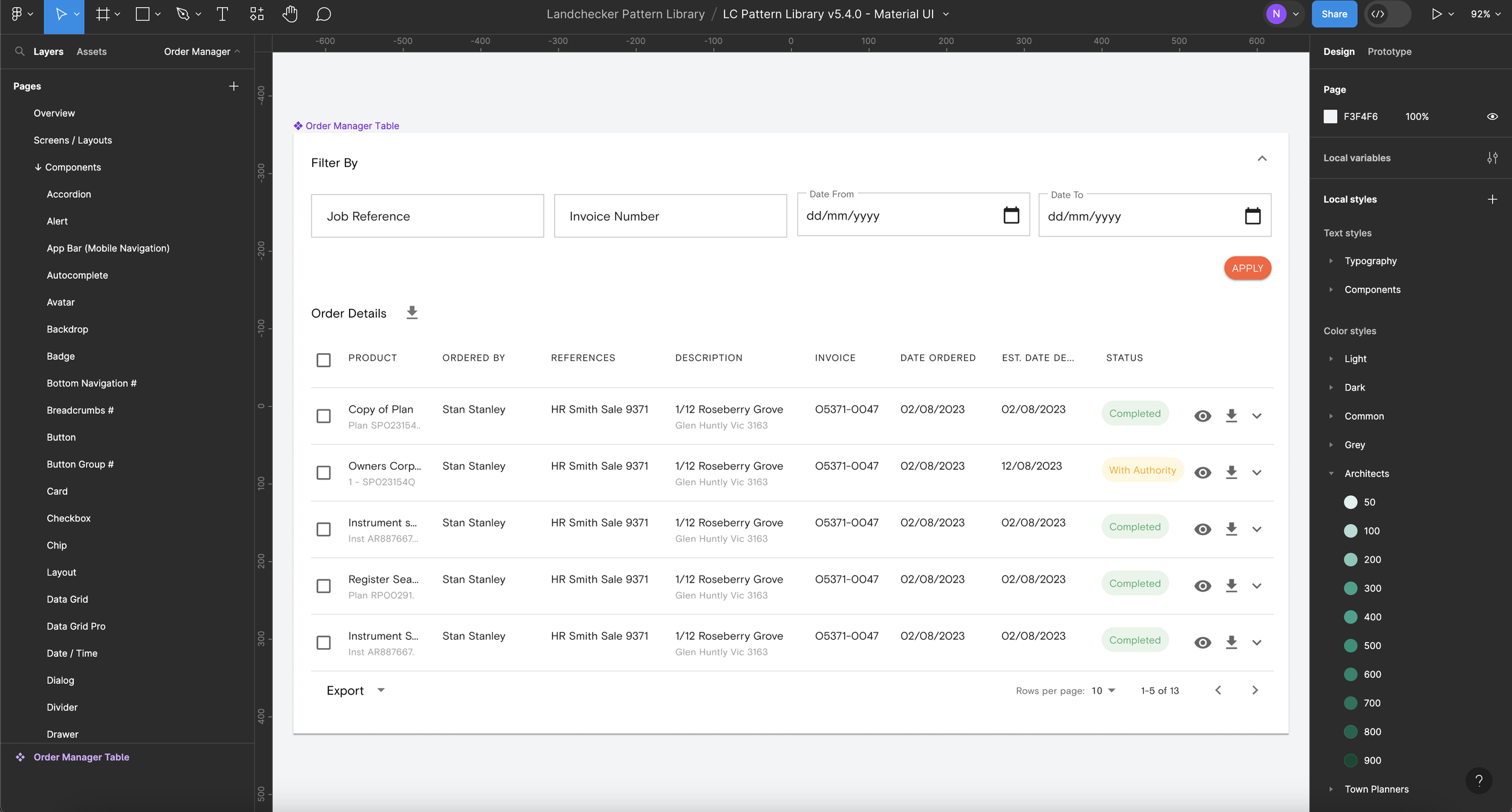
Order manager table component in the LC pattern library
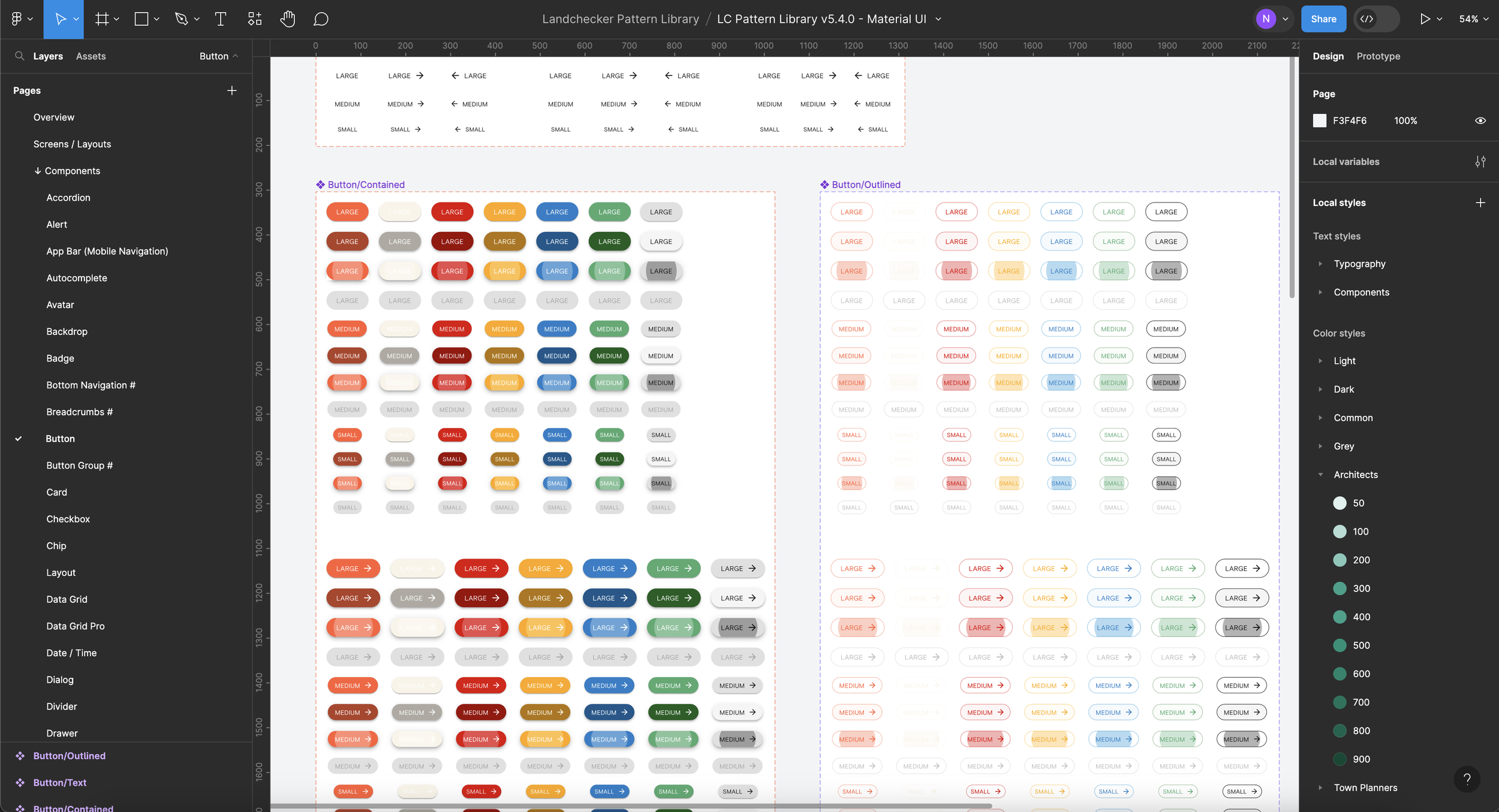
Button component that makes part of the order manager component in the LC pattern library
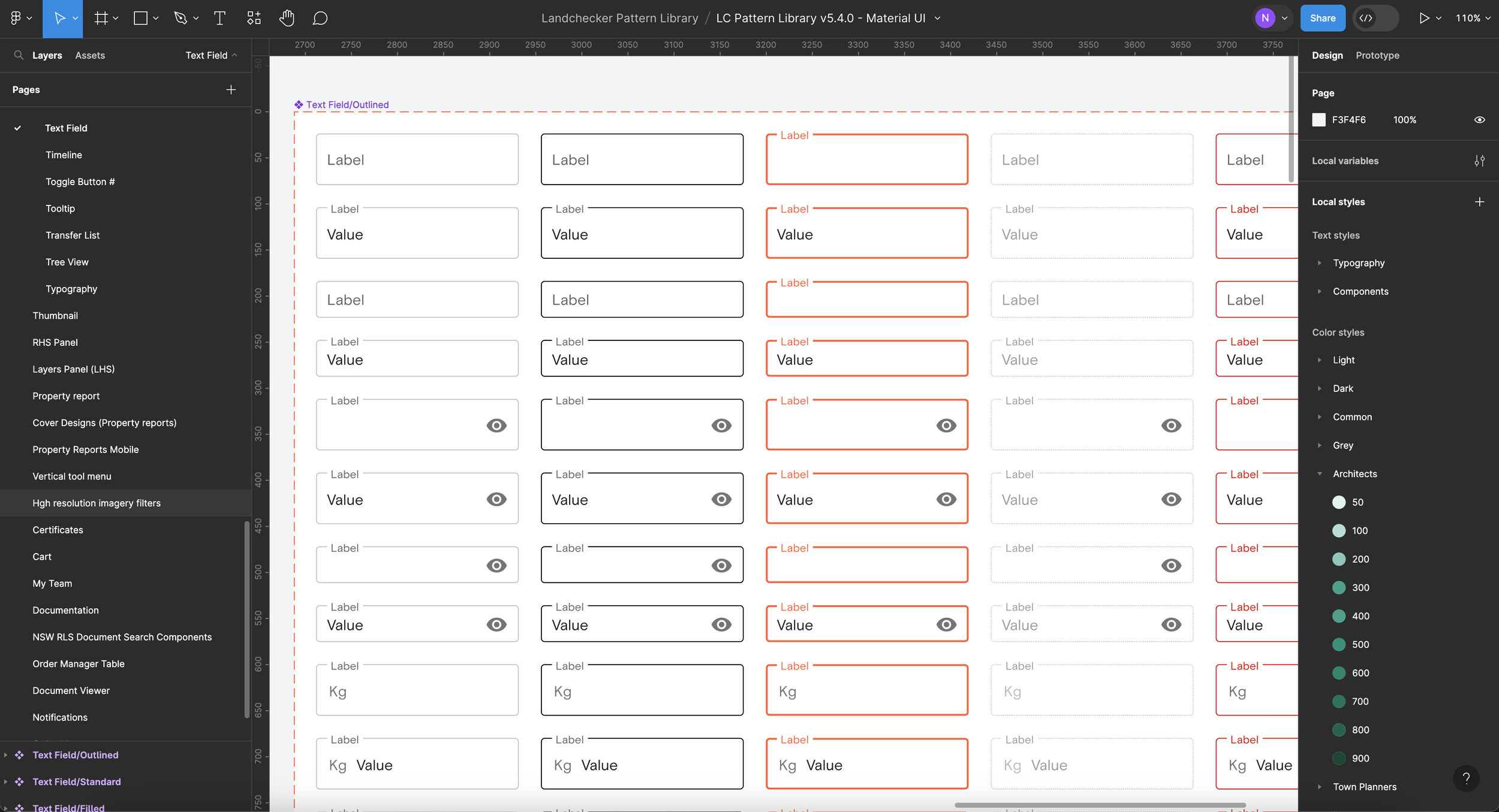
Text input component that makes part of the order manager component in the LC pattern library
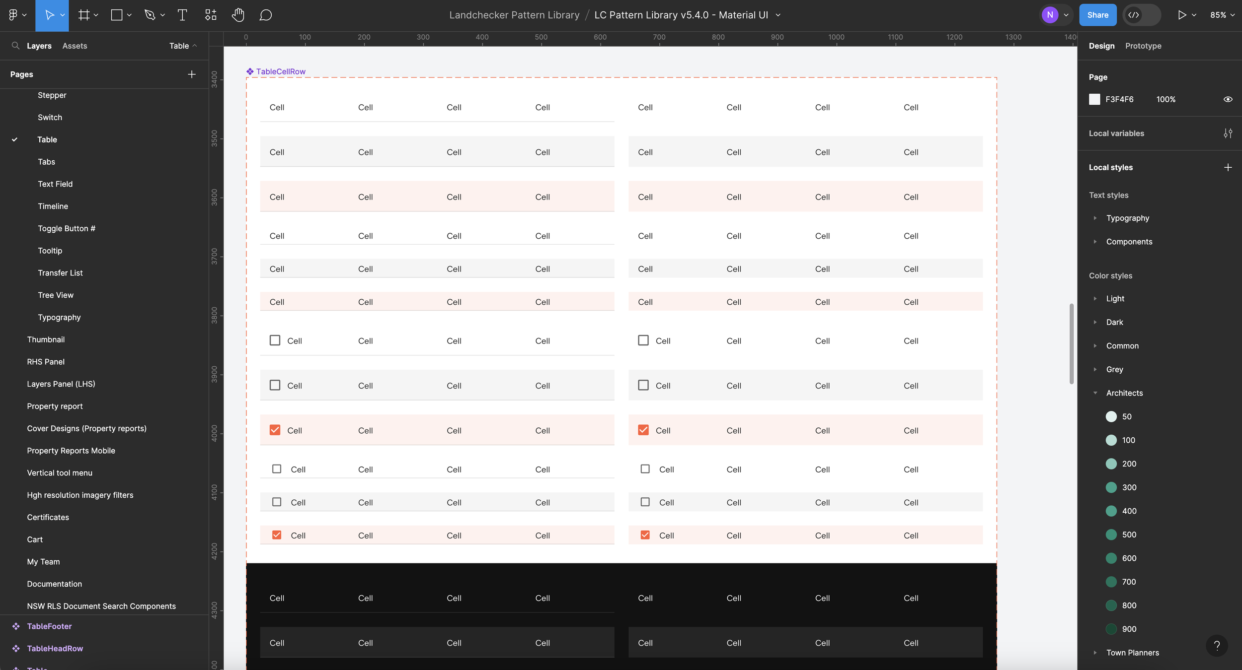
Table row component that makes part of the order manager component in the LC pattern library
App page mock up created in less than a minute with an up to date and detailed pattern library.