

Background
In the early days of Landchecker the product was free and the web application was accessible without having to login, heading over to landchecker.com.au would land you straight on the map application. This created problems as the business was tearing through its funding without a clear vision for how to commercialise. It was time to uncover insights to help inform the direction to take.
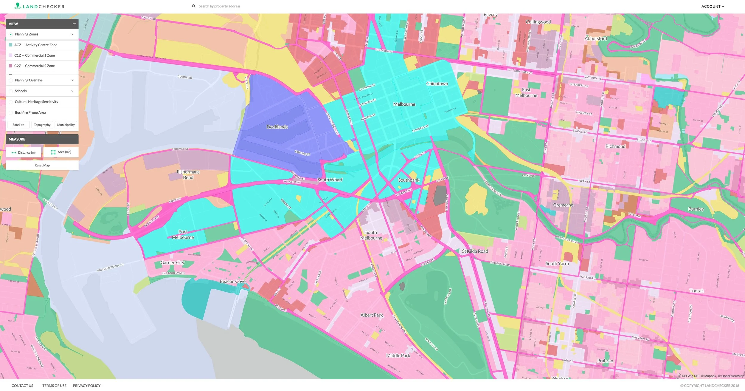
The homepage in the early days was also the map platform.Team
Developers (frontend, backend and data engineers)
Product Manager
UX Designer
Interactive prototyping
User Testing
UI Design
Integrated UX & Brand Strategy
UX Methodologies
Lean Canvas
Competitive Analysis
Comparative Analysis
User Interviews
User Journeys
Discover
The initial discovery period involved myself working closely with a product manager to conduct customer interviews and fill out a detailed comparative analysis on our competitors. The interviews were instrumental in uncovering how each persona type uses Landchecker and what functionality they use daily and therefore consider high value thus having a higher propensity to pay. This information in tandem with analytics usage data gave us a more complete story of what our customers were doing and what functionality they needed and valued. We documented all customer interviews and synthesised key insights into confluence to refer back to for future decision making. The key insights were grouped in to the following themes:
Need for help content and informational content on products.
Simplified plan offerings
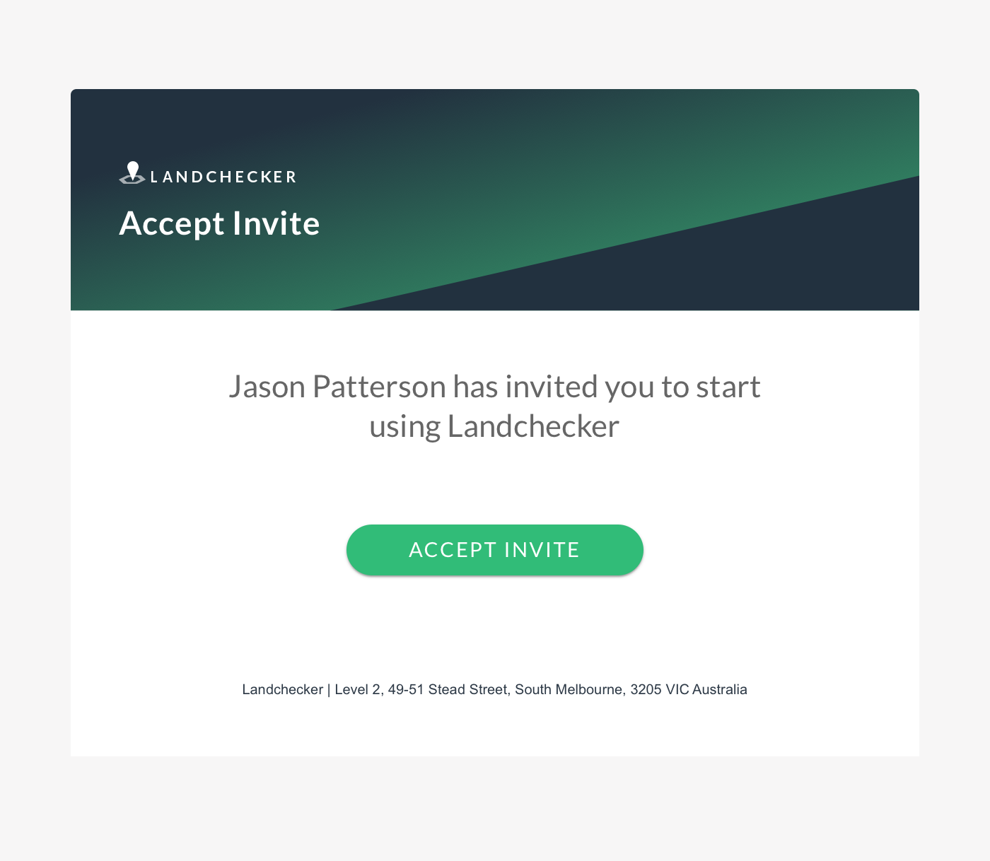
Ability to self manage a subscriptions and invite team members
High resolution imagery and property reports were what they currently paid for but also a propensity to pay for Site Finder and more userful measuring tools.
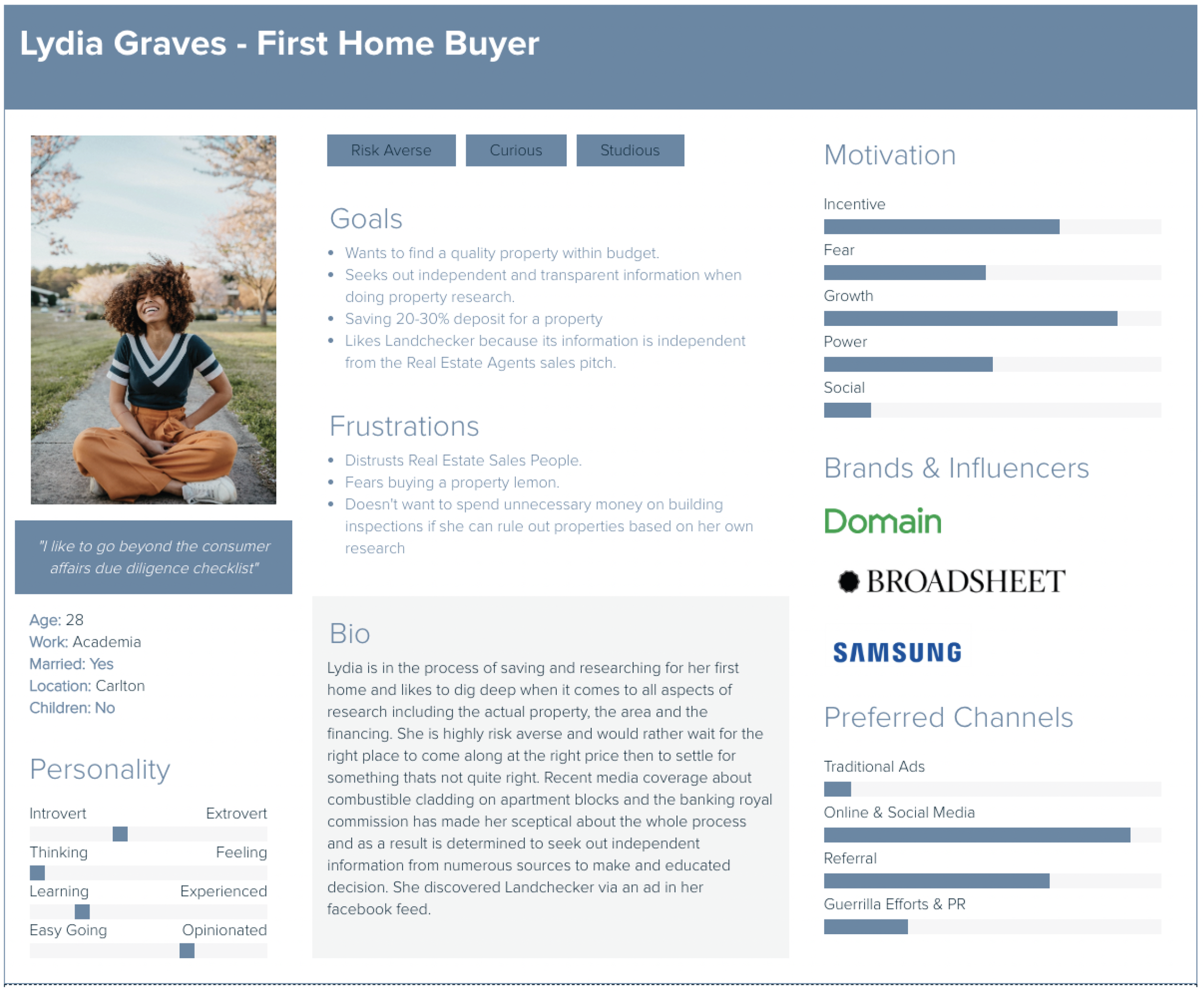
After speaking with different customers from each segment we had a good amount of information to build out detailed user personas, so I took this opportunity to update them for this and future projects.
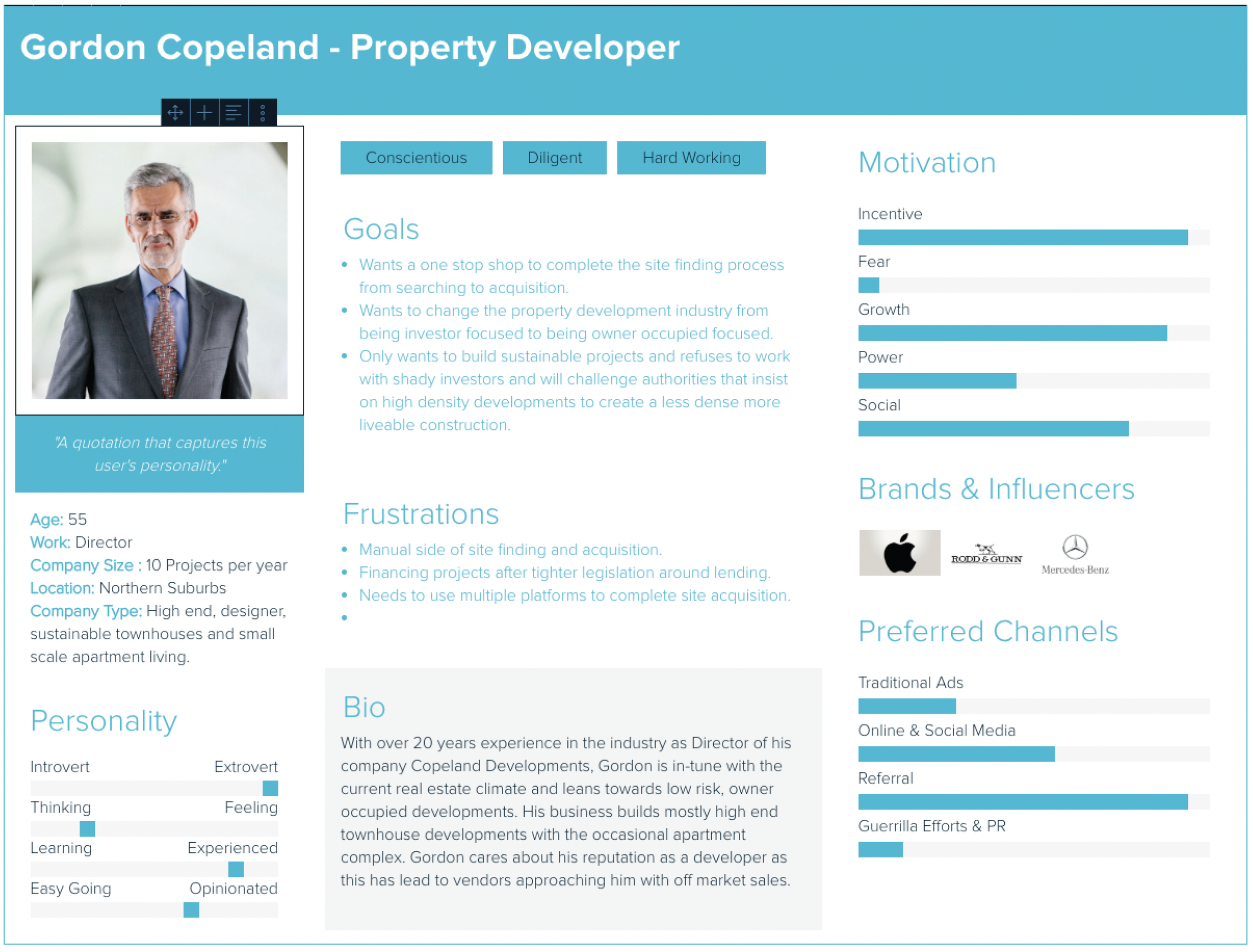
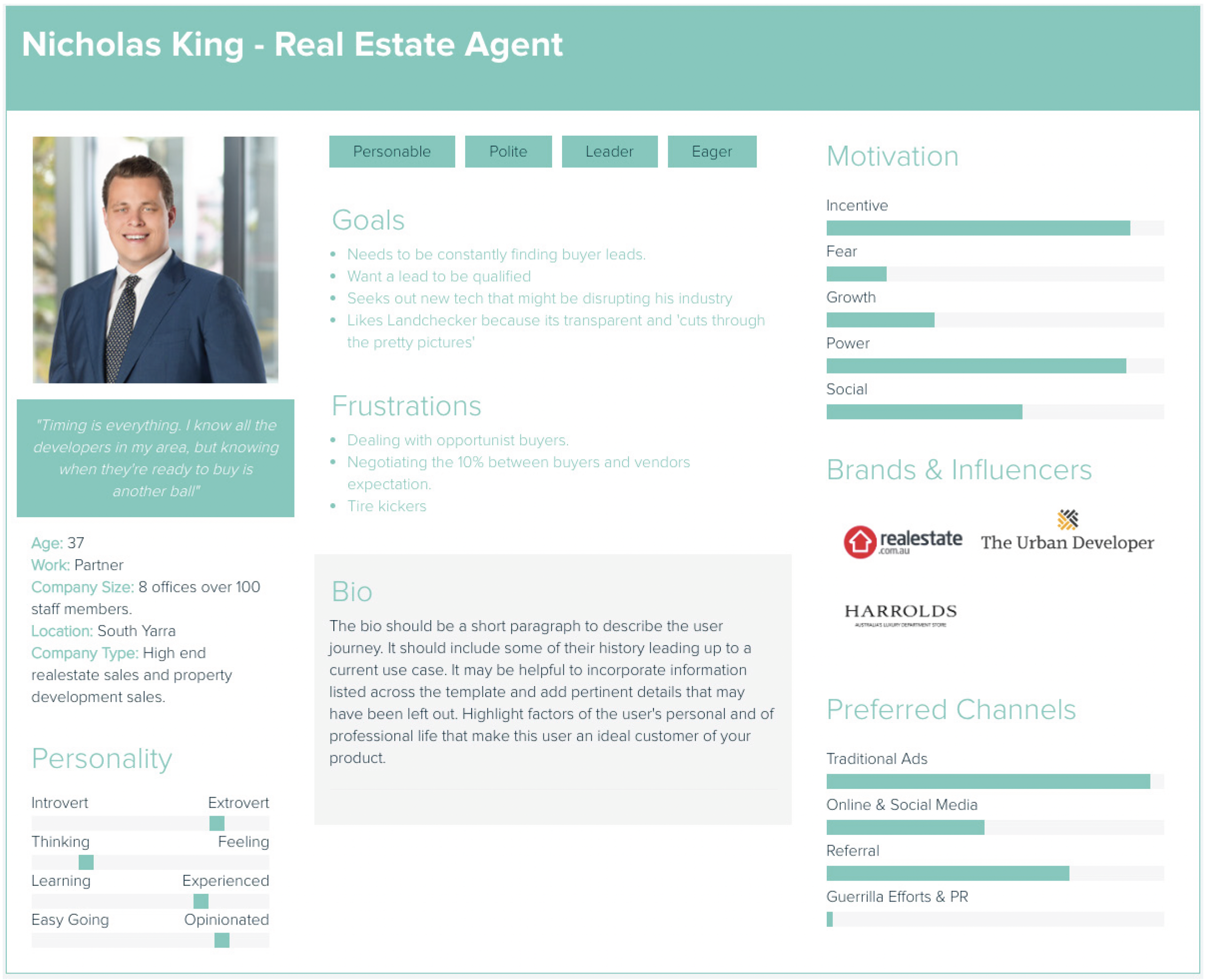
Personas based on customer segmentsThe comparative analysis helped understand where we sat in the market. We uncovered the following insights:
There are many proptech startups doing similar things but not as comprehensive as us.
Few offered a freemium experience
Very few were national and most focused on one state or area.
This analysis along with the customer interviews helped define our USP and where we need to focus out resources to build value for our customers.
The next step I took was to map out all current state user journeys alongside future state ideal journeys. This was important in understanding potential customer pain points and how we might improve task flows not fully considered previously. One such flow was the self-serve upgrade to paid plan (example below) the designs for this flow were iterated and updated based on user journey maps.
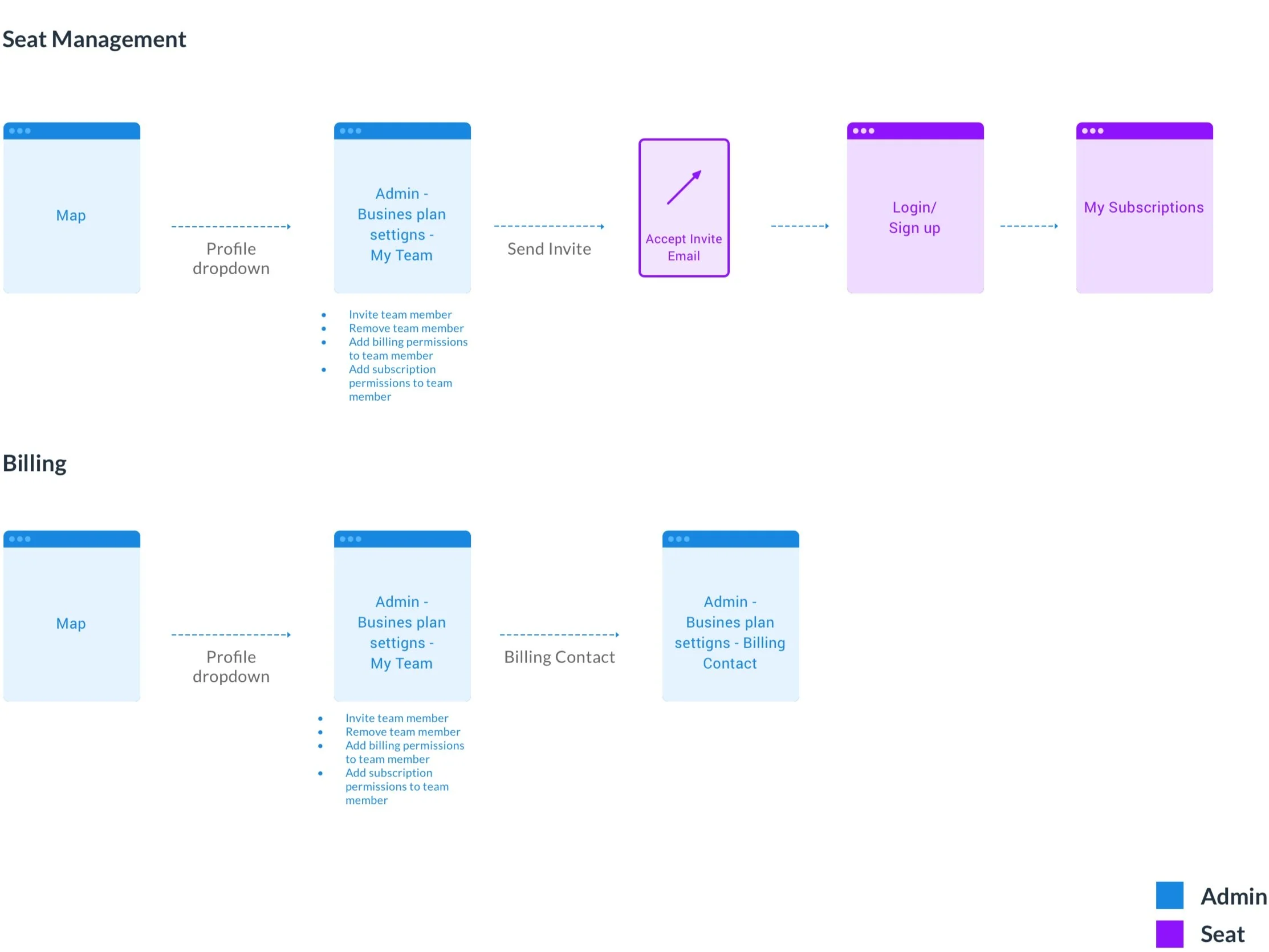
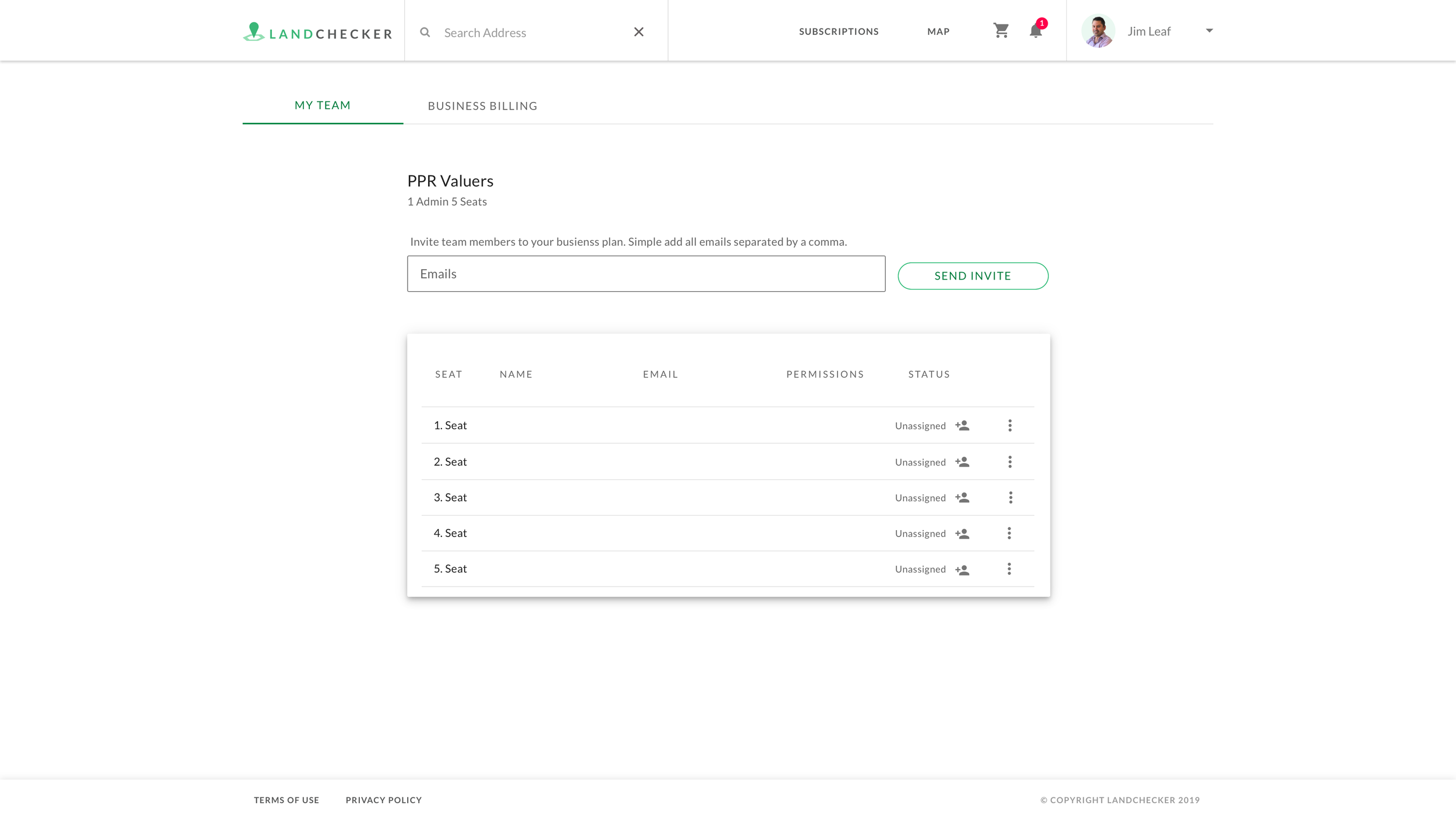
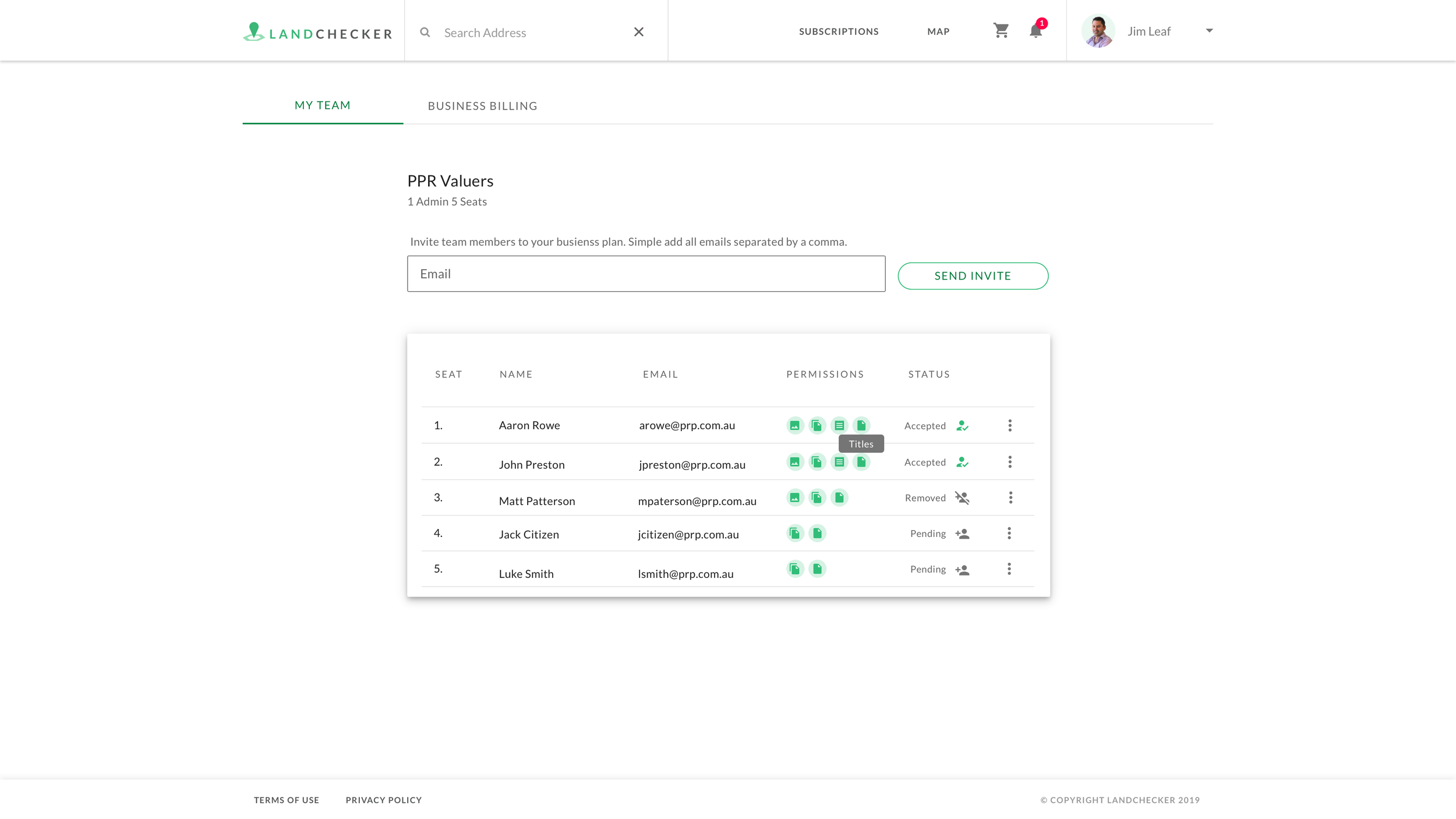
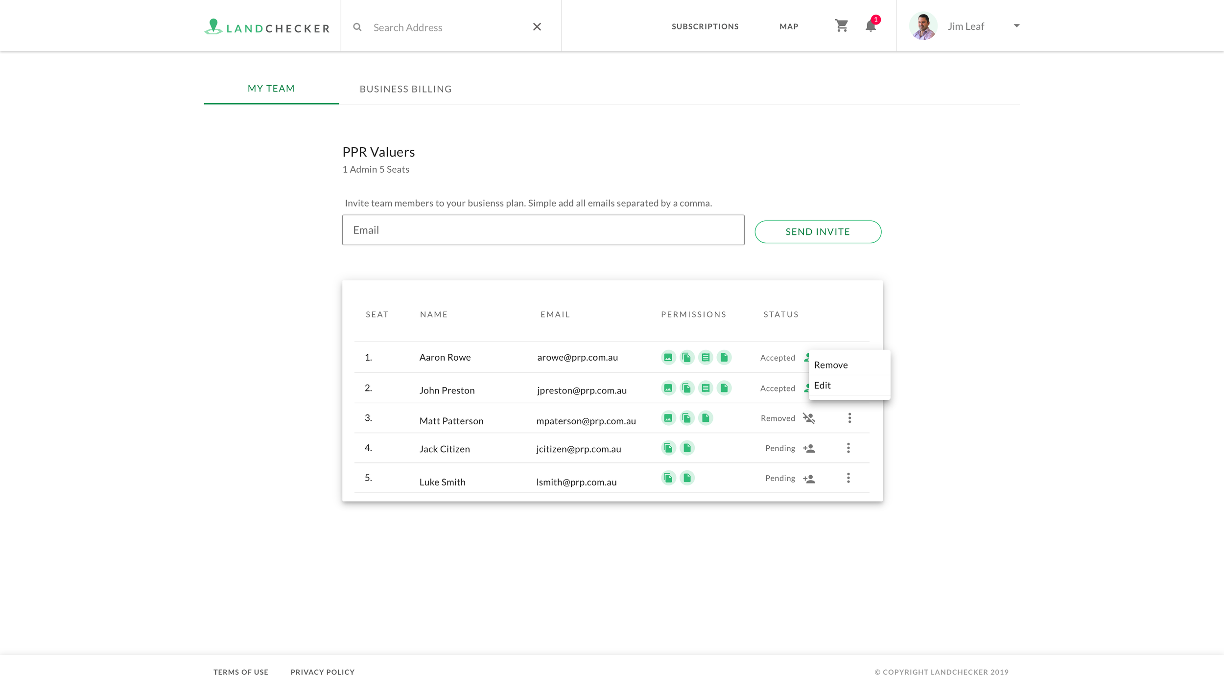
Task analysis flow - adding a seat.
All of the insights gathered in the discovery phase were shared with the CEO who used it to develop a new commercial strategy. This was used to set goals and measure success.
Design
One decision made from our discovery sessions was the need to create a separate sub domain for the application leaving Landchecker.com.au purely for content purposes and app.landchecker.com.au for the platform. I created a site map to define what Help and sales content we needed to create in collaboration with the marketing manager in order to build out the content pages.

Content sitemap.The journey maps and task analysis helped define design improvements for the plans page and how we might design an account area for our customers to self service. This was an important business requirement as we did not have a dedicated sales team at this point and we needed a way for customers to find us, find the information they needed about the product and easily self-serve the purchase of a subscription.


Develop
I designed interactive prototypes for the plans page and checkout. Once these were complete we invited select customers to user testing sessions and asked them to complete the task of selecting a plan and checking. We record the sessions to observe any pain points and improve the flow in the design phase. After these sessions we asked for feedback on other possible suggestions to improve the process. Some issues raised in this session include the following:
Remove unnecessary steps in checkout and show steps to complete
Original designs did not link to the map on completion of purchase this was fixed
Confusion between business account settings and my account settings


Deliver
Handover to developers included developer kickoff where we scoped out development tickets in jira based on the designs. This helped define a project timeline that included backend, frontend and testing. Since during this time we were a small team, testing was completed by the non development team members facilitated by myself.
Once built, event tracking was instrumental in validating the optimised user journey this, along with a/b testing uncovered slight improvements to copy we could make to improve the conversion rate. We also set up heat maps to understand what caught customers attention on the content pages. All of this data was used in future projects to help understand what customers were doing and how we could improve the experience.
The final outcome delivered in 3 parts:
Content site with information relating to the products and services we sell
New plans that reflected what our customers wanted
Improved dedicated subscriptions page that was accessible to visitors that compared the plans pricing and what was in each subscription.
Once the all the designs from the new commercial model were implemented and customers migrated across to the new subscriptions the results on the businesses revenue was as shown below:
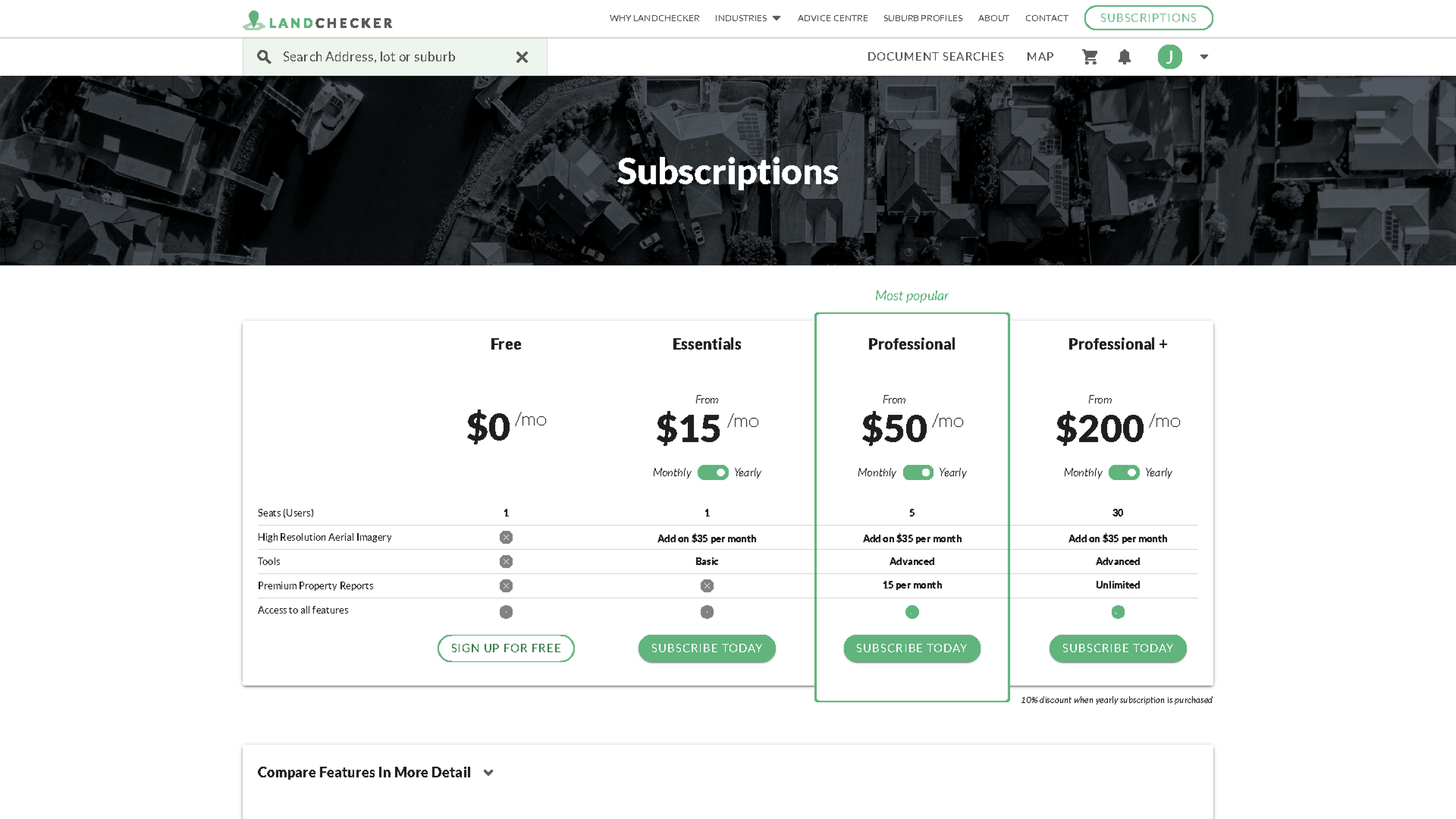
Subscription page after.

Subscription page before.