
The Challenge
Good Cycles is a social enterprise and charity using bicycles to engage, educate, empower and find employment for those experiencing disadvantage. The organisation consists of a retail bike shop, bike servicing centre and consumer bike maintenance courses, with 100 % of profits going towards social programs which work with asylum seekers, refugees, at risk youth and longterm unemployed. Good Cycles needed an consistent user experience online and in-store as well as an innovative way to leverage their social message.
Year: 2016
Team: 2 UX Designers
Tools: Axure, Illustrator, Keynote
Client: Good Cycles
Key Methodologies
Contextual Inquiry
Business Model Canvas
Swot Analysis
Competitive Analysis
Comparative Analysis
User Interviews
Persona Creations
How Might We's
User Journeys
Heuristic Evaluation
Collaborative Design Studio
Card Sorting

Discovery
Paper prototyping
Interactive prototyping
User Testing
UI Design
Integrated UX & Brand Strategy
Contextual Inquiry
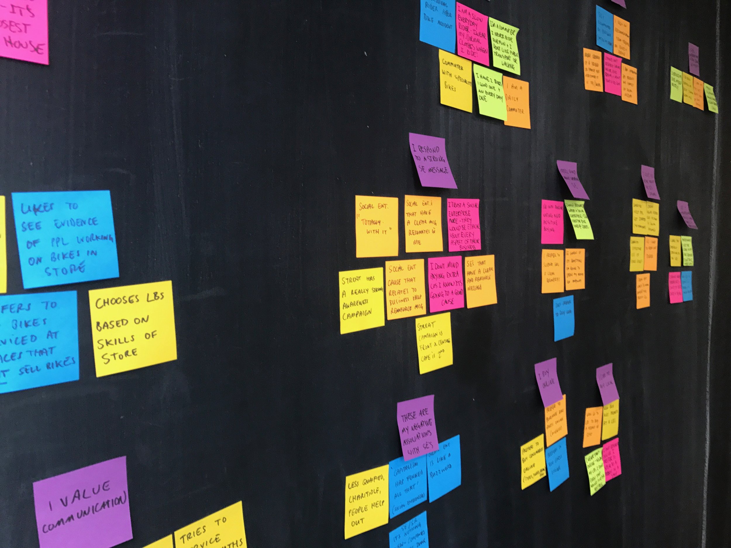
After the client meeting we decided we needed to validate some assumptions within the organisation about how the public perceived a service provided by a social enterprise, we began this by conducting interviews with stakeholders as well as users. Our research uncovered some interesting information including a market that whole heartedly supported social aspect of the business as well as others that had apprehensions about the concept. This played a crucial part in understanding how to publicise their social message.
We also conducted some contextual observations within the retail store and the bike hub to see how the customers interact with the physical space. We then went on to the website to see if this was reflected in anyway online. This uncovered some major pain points customers might experience when trying to book in a service online or try to find any information about their in-store stock. Speaking to the Mechanics we found that approximately 2-3 of 10 booking per day were online bookings the rest walk-ins, was this a direct result of the point point experienced in the online booking system? This might be an aspect we test further down the line.
Competitive Analysis
The competitive analysis was completed to see what other cycle stores were focusing on and to see where we could find a point of differentiation with Good Cycles. The information uncovered showed that areas not covered by our competitors included staff and mechanics profiles with their specialty expertise and interests also, no other cycle store that provided bike servicing had an option to book online. This was a good area to focus on to differentiate Good Cycles from its competitors; it also helped enforce a message of safety and professional service which was an area of doubt uncovered in the user interviews.
The comparative analysis helped uncover how other social enterprises in different areas with a strong brand and social message were successful. I looked at organisations like Streat and Who Gives A Crap and found that they used different styles of messaging like data visualisations and short bullet points with graphics along with more in-depth messaging to create an integrated messaging campaign.
User Interviews
With my team I undertook a series of user interviews with participants who were avid bike riders, daily commuters and leisure riders to discover servicing habits and perceptions of social enterprises. The information was critical in understanding how to approach the service design aspect of the organisation as well as any apprehensions the biking community might have using a social enterprise. Some key responses can be read below.
"I like a local bike shop that listens and follows through with the service"
"Social enterprises that have a clear message resonate with me"
Personas
DANIEL
Lives: Essendon (wife and 2 young kids)
Works: Myer accounts department
Tech empathy: High
Owns: Windows laptop, Android phone
Wants:
Convenient way to service his bike
To know that his bike is in good hands
Needs:
Professional servicing options
A scheduled service reminder
GEORGIE
Lives: Port Melbourne
Works: Researcher at RMIT
Tech empathy: High
Owns: Macbook, iPhone and iMac
Wants:
Has a history of ethical consumerism and prefers to spend her money at these businesses.
Appreciates knowing what impact her purchase has.
Needs:
She is pressed for time and needs a convenient place to service her bike.
A reminder when her next service date is due.
Define
User Journey
We decided to collaborate on a few different user journeys, one for the online booking for a single bike service, one for a user wanting to purchase a product and one for a group bike service booking. These helped us understand users pain points recommendations on how to fix them and also user touch points online and in store and how might we push the social message cohesively in these areas. Here they are below.

Problem Statement and Hypothesis
Once I had fully fleshed out the personas I worked on the problem statement, this is important because it helped me stay on track through the rest of the design process, the problem statement was referred back to like the persona. The hypothesis also known as the solution statement is the proposed solution to the problem statement with a metric for measuring the success of the solution.
Problem Statement
Daniel needs a convenient and professional way to service his bike because he values being part of a cycling community that also does good.
Hypothesis
We believe that a well executed, multi levelled awareness message for the social enterprise will strengthen the bond with existing supporters and enhance the brands community awareness message for prospective customers.

Collaborative Design Studio
The second week in on the project we organised a time to go meet with some of the stakeholder in the business and conduct a idea generating design studio with some mechanics an intern and the communications manager. The clients were happy to participate and understood the value of the exercise as they were the subject matter experts and collaborating with us the UX designers gave them some ownership of the outcome as well as helped us understand their insights into possible solutions.
Develop
Card Sort
An open card sort was completed to better understand how to organise and even reword if needed the pages and content. This was an eye opener as most of the participants categorised the content similarly but completely different from the current categorisation of information on the Good Cycles website.
Paper prototyping
I sketched out the online booking form design and quickly made up a paper prototype that I could test quickly and iterate. This helped me understand the best way to design the form with the user in mind without investing my time wireframing in Axure.


Interactive prototyping & User Testing
I then moved on to creating a clickable wireframe in Axure of the form design, to test with different users. Along with the form functionality the messaging was also tested. This process was a little bit harder as we were asking users what messages resonated with them and this doesn't always have a straight forward answer.
Deliver
The Final Deliverables
The final outcome was made up of 3 main areas the online, offline and the strategy to keep them inline. The 'online' website redesign was accompanied by the design specification a document made up of annotated wireframes. The offline or ‘in store’ messaging encompassed the data visualisation posters and other high impact concepts for the retail space. And the service design strategy which was developed in order to empower the client to implement new ideas and use UX methodologies to keep their online and offline inline.


